Monday 12 December 2011

Arnulf Rainer and Experiment

Arnulf Rainer is a painter who does quite abstract art work. One of his most famous work is where he would get portraits of people and then draw over them in black paint.


Nearly all of the pictures in this type of work that he did are quite disturbing and seem to relate to have some sort of pain to them by the faces that are being made by the portraits, never the less, I decided to try it out my self.


Also the thing about these photos and where the value comes from is the link and similarity between them and the work of Arnulf Rainer, not anything like the visual elements, or if it is pleasing to the eye.
 

Self Portrait-Chance and Destruction

For this experiment, I used the self portrait of my self that I used for the Idris Khan work.

For this task I got the portrait and printed some copies out so that I had a physical copy of the photo because I wanted to take the photos through  some tests...


This is the original photo

For this one I put the photo in my oven and left it for 2 minutes.
This is what happened after:


I put this on submerged under water for a couple of hours.
But not much changed after I took it out.


I put this one in a bowl of water and then froze it.

And I left this one out side under ground for a night.


To anyone just looking at these photos, it probably would come to there minds as being interesting but having no value, just ruining some photos. While that is true, the value from these comes from before the out come of each of the things I did, I had no idea what would happen to them the next time I would see them, I have no control over what will happen. That is what gives these value.


Tuesday 6 December 2011

Self Portrait-Idris Khan

This experiments was done by using a self portrait of me, and some inspiration from some other artists work.


The first one was was inspired by an artist called idris Khan and his work is that he takes photos of buildings and structures, and then edits them so that there are lots of the same photo just on top of each other, then he edits the contrast until it has the apparence of something like a sketch.


I had a go at trying this my self using Photoshop and the portrait of me. This was the final out come.   


To do this type of editing, I needed to use Photoshop. The first thing I did was to take the portrait of me and then open it in a new document in Photoshop.


Then I cut around my face so that the green back round that was there has gone then I made about thirty layers and copied the same photo of my self onto each one of them, but I also lowered the opacity on all of them so there were slightly see through. 


Then all I needed to do was move them out of line just slightly and keep making copy's to fill in where it looked a little to see through.


So now it was looking very similar to the type of work that Idris Khan. So the only thing left was to make it black and white just like his art work.


Sunday 27 November 2011

Rodchenko

Rodchenko was a Russian artist who's work consisted of photography, sculptures and graphic design, he was born on 1891 and died in 1956. Because of the time he was alive, all of his photos where in black and white. Even though it might seem like a disadvantage that they didn't have coloured, but looking at the photos that he did took, it does seem that maybe taking them in black and white was the best chose because some of the pictures the took might have not had the same impact if they were in bright colour.


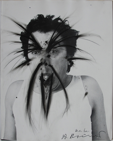
He was also one of the first people to do manipulation in photography. He would do this by mixing to photos by putting them on top of each other and blending them so it looked like it was all one picture. 


He also did the type of art which consists of placing or editing two photos or pictures together to make one picture.

When looking at this picture reminded me of the work of John Stezaker, and how his work could have been inspired by the way Rodchenko did the first of this type of art work.

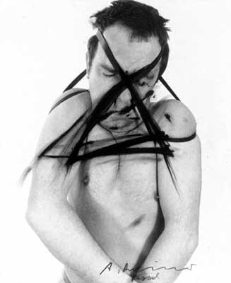
On top of his photography, he did quite a lot of collages, or Photomontages, using a mix of photos and different coloured shapes.


This was also the first of it's kind, using different shapes and photos, put them together to make one photo, also know as a collage. His work is all basically the same thing, using different images and merging them to make one picture (much like the work of John Stezaker, the only difference is the way that Rodchenko uses the images or the way that he mix's them together. 


I also tried to make a picture that was inspired by Rodchenko and it was this collage that he did.


This was mine.


As you can see it is not completed and this is because it was not turning out as I had wanted it to. For example, Photoshop does not have a 'shape tool' so I had to get square oh what ever colour I wanted and then cut out what shape that I wanted which took a very long time. Also to get the text to be smaller on the left had side was very tricky as well because of the limit of editing you can do with the text, but it was just to see what it would look like and experiment and that is what I did.

John Stezaker and Experiment


John Stezaker is a British artist who uses one portrait of someone, and then adds on another portrait, or a photos of something like a landscape. For the once that he uses a portrait and a landscape photo, he doesn't just randomly pick and place the photos together, he uses composition to a line the two photos so that there might still have slight human features.


He is able to do this in this particular photo because of the way the edge of both of the cliffs follow the edge of both of the shapes, there for making it have alight human features. 


John Stezaker - Mask X  - The Approach

By using the visual elements such as shape and balance, this type of art is very effective because of the way that you have to try and follow the lines and shapes so that you can figure out why Stezaker put the photos in that particular positioning.

The other way that he does this type of work is by using two portraits on top of each other but doing the same thing, using the two photos and lining them up to make on face. This way seems much easier because you already have the faces, now all you need to do is put them in the way that you want them to be in.


As I said this way does seem much easier, but I think that Stezaker must of token some time to plan out and try different ways of using composition in each of his pictures. The reason that I think that is because on some of his pictures both of them are vertical, some of them are both horizontal, and some of them and diagonally, therefore some of them must have worked better than others.


So after I had seen this type of work, I wanted to try and have a go. The first thing that came into my mind was that if I needed different portraits, like my self but me looking different ways because that is what seems to happen in all of the portraits that he used when doing it, but i thought because this is just an experiment, I just used the same photo and if I wanted to take this type of work further, then I would try and do it as similar to the original because that would be where the main value of the picture came from.


So as I said with the other experiments, there is not much value in the photo it's self, but the link that can be made between my work and the artists work and the similarity with them.

Monday 21 November 2011

Composition: Own Experiments

Composition is the way that you set things out in your photos. Lots of things can make up composition such as the visual elements, the way that your eye is lead around the photo, any contrast between things like colors or shapes, and the balances of these colors and shapes.

I took the following trying to mostly lead your eye around to a specific place, or because there were some similar things that a cured that seemed to make a certain pattern.

So for this one i got low to the ground, saw that there was quite a few parallel
lines all going the same way and because I focused at the bottom, your eye
should be lead upwards from the bottom.

For this one i was thinking of doing the same thing, but because i used the
 flash,  it made the closer things much more lighter, particularly the bin,
so the lines here just go and fade into the darkness.


This is a very good photo if you are talking about composition, because first
i wanted to get all of the lights from the lamp posts in a line
so that would lead your eye, but it ended up being a good photo because
of the way the edge of the path is even horizontally
and follows it's self away. 


Tuesday 18 October 2011

Stephen Gill Field work (Out-side School)

Even thought I took these photos quite a while ago, I am still very interested with this subject and thought it was relevant for this project. 

While I was away on holiday in France walking around the small towns over there, I noticed something that I had not before. Everywhere I looked, I could see that all of the man made structure's, buildings, windows, and signs were made out of all the same shapes, and it got me thinking about the reason of why that is, and it is because if they were any other shape, it would look strange and different in almost all of the photos. And then that got me thinking about why if you make something such as a painting, building or mostly anything with uneven shapes it instantly becomes abstract but in some cases that can make what ever your making look even better. Because at the end of the day, its all about making the thing look good and be appealing to the eye. So finally, all of the photos that I took and have put into this page, I took them because of the common shapes there made from, and try to imagine the photo but instead of those shapes replace them with abstract and uneven shapes.